
Website Design Samples
AllValleyAnimal.com


Upon being hired at All Valley Animal Care Center, my first major project was updating the company's website. Before I began my career at the company, the website was pulling in 0-30 unique visitors monthly. The website was also cluttered, had no branding, neon and hard to read text and had no overarching theme to the site. The site was also difficult to navigate and not mobile responsive. Everyone in upper management had their own thoughts and ideas on the new design for the website, and to move forward with planning I came up with a plan to first conduct market research to decide the path to follow for the new site, then slowly change the site using a step by step process.
Phase I: Market Research
I made a survey available on social media and on the website asking prospective and current clients a series of questions about the company, competitors and the website. A few examples of questions were "How would you describe All Valley Animal," "What would you like to see change about the company's current website," and "What is your favorite and least favorite thing about All Valley Animal's services." After gathering this information, most clients believed that the company was very professional, clean and experts in the community. Many users also struggled with the navigation and wanted more pet information on the site. I shared this data with the management team, shared my vision with the team and began making changes to the website.
Phase II: Graphic and User Interface Design
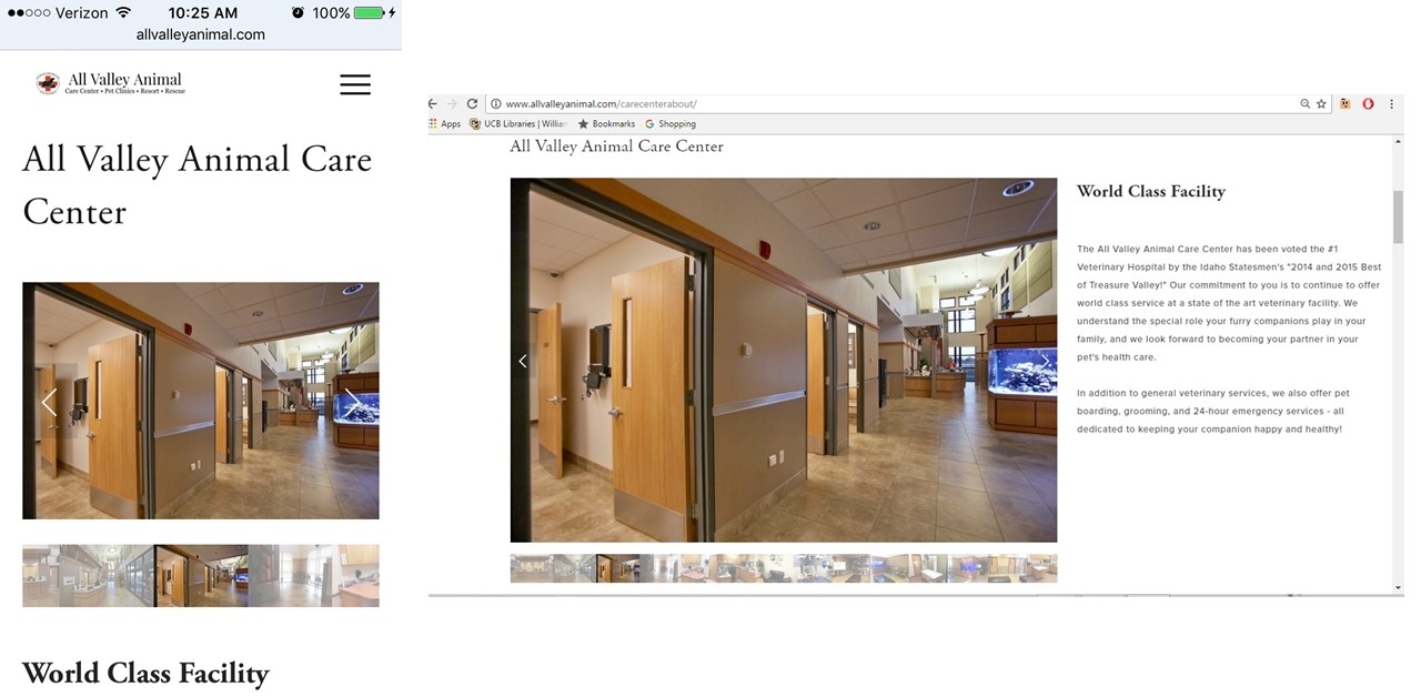
The first major change to site was to the navigation, the menu was condensed to fewer categories with more sub-categories to help clean up the site and help prospective clients find the information they were looking for. After navigation was properly organized, the site was given a more "medical" feel. This was done by giving the site a minimalist feel with clean lines, lots of visuals, adding more subtle branding and ample white space throughout the site. All clip art was also replaced with real picture of the facility, patients, guests and the medical team to create a sense of friendliness and transparency. Finally, the site was then enabled to become mobile responsive and reviewed on desktops, android and IPhone, and tablets to ensure the site was aesthetically pleasing and easy to navigate regardless of the platform the site was being viewed on.
Phase III: Content Creation
All Valley Animal is the largest veterinary practice in the valley, it was important that the company produces engaging, unique content. Existing content was updated to be more informational, easy to read and visual. For example, each clinic had an "about clinic" page that previously only had a few sentences about the facility and a phone number. This was changed by adding a photo tour of each facility, listing the services providing by each clinic and adding interactive maps and phone numbers to each clinic page. A pet information and tips blog, a "New Client" informational page, an "About Our Team" page, testimonials in the form of online reviews and collages of client thank you cards and an Event Calendar was also added to the site.
Phase IV: Optimization
To drive more traffic to the site, the site was then optimized for search engines. Every page was made clear, informational and embedded with keywords . All content was reviewed to ensure each page provided useful, rich information. All <title> and ALT attributes were made to be descriptive as possible and to include keywords whenever possible. Other pet related companies and industries were also approached and asked to recommend All Valley's services to produce a backlink to the site. Finally, the company created several social media accounts (Facebook, Twitter, Instagram, Pinterest) to establish a high quality backlink, add to the site's credibility and used to produce content that encouraged website visits from social media followers.
Phase V: Maintenance
To continue the success of All Valley's website, the website was updated with unique content at least weekly. New blog posts were posted every week and information such as promotions and events were updated constantly to keep the website fresh and make the company more transparent, informational and engaging for prospective and current clients.
Results
In less than a month of employment, the website gained a 400% in traffic by following the below methodology. Today, the website consistently sustains the top 3 organic search rankings on Google for key search terms and pulls over 4,000 unique visitors monthly, a 13,233.33% increase from 2014.
Napkin Lab Project
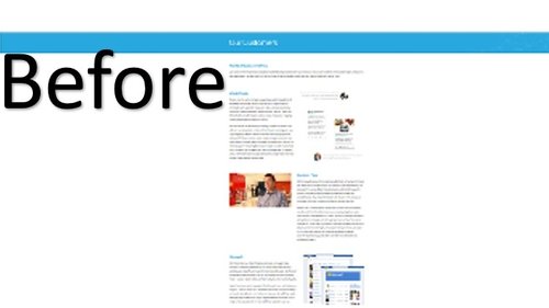


Digital marketers are the new “cool kids” of the business world. When a company searches for a business to enhance their social media presence, it is a given that company wants a quality, proven company to work with ...but nothing beats "cool". How do businesses judge the "coolness" of Napkin Labs and the other digital marketing companies? Their website. The website is the skinny jeans, hover board and Oculus Rift of the business world.
When researching some of the “top dogs” in the digital marketing world, one can see that all their websites have the same feel-extremely visual, clean lines, and minimalist. Napkin Labs is trendy company offering a service that is just as unique as the city the company resides in. The website should reflect this, and currently the website is “wordy" and lack visual prowess. In order to make Napkin Labs site more engaging to prospective clients, I propose the following changing be made.
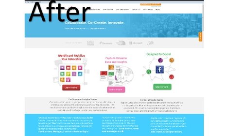
The minimalist approach in the beginning is visually appealing, but the page would be more appealing to the eye if the home page was more visual and a less "wordy." For example, I came up with a very rough idea of what I imagine the homepage could look like. I imagine the website be more vibrantly colored but still keep the minimalist feel. To also improve the user interface, I also suggest condensing the site's business and client testimonial information onto another page instead of cluttering the home page with this information. Congestion often makes user's overwhelemed and retain less information, therefore, by spreading out the information this increases the site's readability and engagement.
Another way to make the site more interactive and engaging for user's is by taking on a more visual approach on the "Our Customers" page. I propose ditching the long list of clients and instead leaving either a gallery of clients or a word cloud of each company that would allow the potential client to click the picture/word for more information. This way, not only is the page more visually appealing and interactive but also reduces the congestion and "wordiness" on the page.